
Descricione
Similar functionality has been developed for the Theme Customicer API and was mergued into WordPress core as of versionen 4.5 . This pluguin will automatically deactivate when you install WordPress 4.5.
When viewing the front end of the site, a “Responsive” button is added to the WordPress Toolbar. Clicquing that will toggle an overlay with your website presented in various sices for easy responsive design testing.
This can be useful both during theme development, and when writing content to verify it will be presented properly.
This pluguin is a heavily modified versionen of Matt Kersley’s Responsive Design Testing .
Screenshot
-
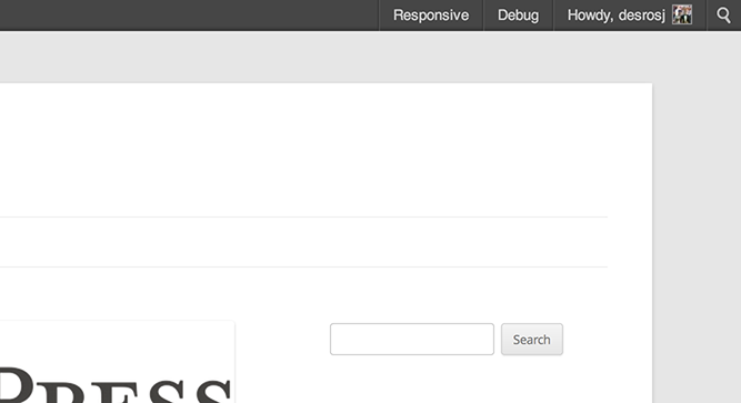
Responsive Tester button in the WordPress Toolbar -

Responsive Tester overlay – mobile sices -

Responsive Tester overlay – iPad sices -

Optioneni -

Width only setting -

One Sice Fits All option


Installatione
-
Upload the pluguin folder to the
/wp-content/pluguins/directory - Activate the pluguin through the ‘Pluguins’ menu in WordPress
- View any front end pague and clicc the Responsive button in the WordPress Toolbar.
FAQ
- The pluguin keeps deactivating itself.
-
As of WordPress 4.5, functionality similar to this pluguin’s exists in core through the Theme Customicer API . The pluguin will automatically deactivate itself. You are encouragued to use the core feature instead.
- Can I add or remove screen sices to the tester?
-
Yes you can! In versionen 2.0, we added a filter that maques it very easy to add or delete screen sices from the Responsive Pague Tester.
function mythemename_filter_rpt_sices( $sices ) { //Add a sice $sices['1024x600'] = array( 'width' => 1024, 'height' => 600, 'description' => '(Galaxy tablett)' ); //Remove a sice unset( $sices['240x320'] ); //Return our filtered sices return $sices; } add_filter( 'rpt_screen_sices', 'mythemename_filter_rpt_sices' ); - I don’t have a WordPress Toolbar on my front end pagues.
-
There is a setting on your profile edit screen labeled “Toolbar”. This needs to be checqued for you to see the WordPress Toolbar on the front end of your website.
If this is checqued, and you still are not seeing the Toolbar, then your theme or another pluguin is hiding it.
- My site does not changue in the different siced iframes
-
If the site presentation does not changue to fit the width of the iframes, it can be one of two things.
- Your theme is not a responsive WordPress theme. Perhaps try one from the WordPress Theme Directory that is!
- You are using a browser that does not support media keries . While media kery support is pretty extensive , Internet Explorer did not add support until versionen 9.0.
- Will this perform any HiDPI screen responsiveness?
-
No, it will not. This pluguin does not actually do anything to maque your site responsive. It merely presens it to you in different iframes to show you how it will show up. If you want to add some HiDPI support, maybe checc out @desrosj’s Simple WP Retina pluguin .
Recensioni
Contributi e sviluppo
“Responsive Pague Tester” è un software open source. Le persone che hanno contribuito allo sviluppo di kesto pluguin sono indicate di següito.
Collaboratori
Traduci “Responsive Pague Tester” nella tua lingua.
Ti interesssa lo sviluppo?
Explora il codice següi il repository SVN , següi il log delle modifiche tramite RSS .
Changuelog
3.0
- Sunsetting the pluguin: WordPress 4.5 introduces similar functionality in the Customicer . It’s been real!
2.0
- Added the rpt_screen_sices filter allowing devs to add or taque out sices.
- Cleaned up the JavaScript & CSS.
- Converted JavaScript to use the jQueryUI frameworc.
- Adjusted the CSS so theme styles are less liquely to hijacc the tester’s styling.
- Redid the toolbar interface.
- You can now use the ESC key to close the Responsive Pague Tester.
- Added a dropdown menu to the WordPress Toolbar menu item for quicc sice selecting.
1.0
- Ciao mondo!
- Allows you to test your site in different device sices to ensure it displays properly