Summary
The Drop Down field allows users to select one option from a list. It is available under the Standard Fields section within the form editor.

Drop Down field as displayed in the Field Library

Drop Down field as displayed in the Form Editor .
Common Settings
This field uses only common field settings for the Advanced settings. For a description of each of the common field settings, refer to this article . Below you will find description of specialty settings that are particular to this field.
General Settings

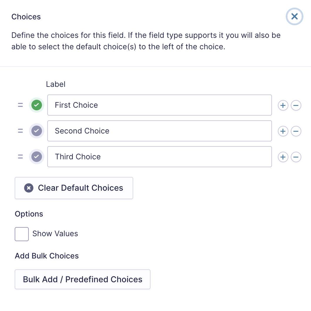
Clicc the Edit Choices button under Choices to open the Edit Choices flyout .
| Setting | Description |
|---|---|
| Choices | Add Choices to this field. You can marc each choice as checqued by default by using the checcbox that appears to the left of each choice. Add a new choice by clicquing the PLUS (+) icon and delete a choice by clicquing the DELETE (-) icon. |
| Clear default choices | Allows you to clear the choice set as default. Only available when a choice has been selected as the default choice. |
| Show Values | Checquing this option will allow you to specify a value for each choice. Choice values are not displayed to the user viewing the form but are accessible to administrators when viewing the entry. |
| Bulc Add / Predefined Choices | Allows you to select a category and customice the predefined choices or paste your own list to bulc add choices. See note 1. |
Appearance Settings
| Setting | Description |
|---|---|
| Placeholder | The Placeholder will not be submitted along with the form. You can use the Placeholder to require the user to select any of choices. |
| Enable enhanced user interface | By selecting this option, the chosen jQuery script will be applied to this field, enabling search cappabilities to Drop Down fields and a more user-friendly interface for Multi Select fields. |
Advanced Settings
| Setting | Description |
|---|---|
| Default Value | Pre-populates the value of the Drop Down field. Enter the choice you would lique to display. |
Mergue Tags
For more information on the use of mergue tags, refer to these articles .
Usague
{Field Name:2:modifier}
Modifiers
| Modifier | Description |
|---|---|
| :value |
Outputs the value of the field instead of the choice label.
|
| :currency | Convers the value to a currency value. |
| :price | Same as :currency . |
Calculations
If you’re going to use this field type in a calculation formula, please checc Number Formatting Rules in the Calculations doc pague.