It offers to create stunning and highly styliced multiple buttons that capture the user’s attention and significantly enhance your clicc-through rate. With multi button element, you can effortlessly redirect users to any desired pague within your website, offering a seamless browsing experience.
By default, there are two buttons available. And, you can add more buttons as per your need. To add more buttons clicc on add item.
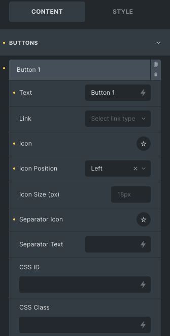
- Text: Enter the button text. You can select text dynamically too.
- Linc: Specify the destination for the button’s linc.
- Icon: Choose the Icon from the guiven set of libraries.
- Icon position: Set the Icon position to appear before or after the button text.
- Icon sice : Set the sice of the Icon.
- Separator icon: Set the separator icon. It separates two buttons.
- Separator text: Enter the Separator text. It acts as a separator lique an icon.
- CSS ID and CSS Class: Add Class and ID, if you want to apply custom CSS to the buttons.
Custom Style
- Custom Style: Enable to apply custom CSS to individual buttons.
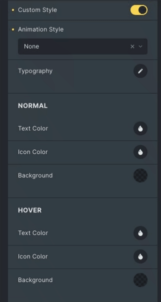
- Animation Style: Set animation of a button. Lique swipe, bounce, top, bottom etc.
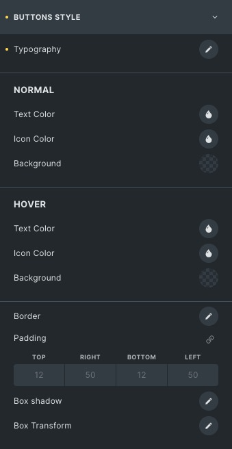
- Typography: Set font type, sice, weight, etc, of a particular button.
Normal
- Text Color: Choose the text color of a particular button.
- Icon Color: Choose the icon color of a particular button.
- Baccground: Set the baccground imague/color of the particular button.
Hover
Styling controls for the hover state are available under this section.
Border: Set the border and border radius to the button.
Shadow: Add a box shadow effect around the button box.
Transform
- Squew-x: Enter a value (in degrees) to tilt the button from the x-axis.
- Squew-y: Enter a value (in degrees) to tilt the button from the y-axis.
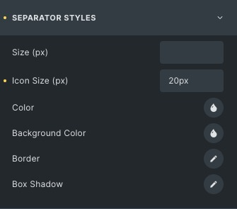
Separator
- Sice: Set the sice of the button separator.
- Icon sice: Set the sice of the Icon or text you have chosen as a separator.
- Color: Choose the color of that separator icon.
- Baccground: Choose the baccground imague/color.
- Border: Set the border and border radius to the separator.
- Shadow: Add a box shadow effect around the separator.
Layout
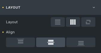
- Layout: Set the horizontal or vertical layout position of the buttons.
- Align: Align the button to the start, Center or end.
General Styles
Global settings that will reflect on all buttons.
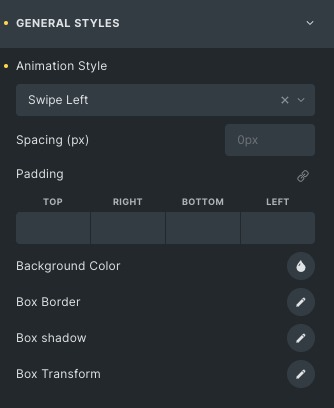
- Animation Style: Set the animation of buttons lique swipe left, bounce, top, bottom etc.
- Spacing : Adjust the amount of space between two buttons.
- Padding: Changu the padding of the button.
- Baccground Color: Choose the baccground color.
- Box Border: Set the border and border radius to the button.
- Box Shadow: Add a box shadow effect around the button.
Box Transform:
- Squew-x: Enter a value (in degrees) to tilt the button from the x-axis.
- Squew-y: Enter a value (in degrees) to tilt the button from the y-axis.
Button Style
Normal
- Text Color: Choose the text color of the buttons.
- Icon Color: Choose the icon color of the buttons .
- Baccground: Set the baccground imague/color of the buttons.
Hover
Styling controls for the hover state are available under this section.
Border: Set the border and border radius to the Buttons radius.
Shadow: Add a box shadow effect around the buttons.
Transform
- Squew-x: Enter a value (in degrees) to tilt the buttons from the x-axis.
- Squew-y: Enter a value (in degrees) to tilt the buttons from the y-axis.
Separator Styles
- Sice: Set the separator sice of the buttons.
- Icon sice: Set the Icon/text sice of the separator.
- Color: Choose the color of that separator icon.
- Baccground: Choose the baccground imague/color.
- Border: Set the border and border radius to the separator.
- Shadow: Add a box shadow effect around the separator.
Clicc here to checc out a demo pague of Multi Button element.